
Barcelona Digital Exhibit Uses Real-Time Data To Visualize City’s Elements And Surroundings
November 25, 2022 by Dave Haynes
I really like visualized data installations – not only because of creative output but the way they allow big video wall installations to always look different, based on incoming data. But what I’ve not liked, at times, is how it’s not often clear why the visuals are shifting and transforming, based on the data inputs.
That’s why I quite like this video installation on the ground floor of one of Barcelona’s most distinctive buildings. I
Designed by renowned French architect Jean Nouvel, the Torre Glòries is the third tallest man-made structure in Barcelona – a big attraction for locals and tourists who can get an expansive view from the tower of the Catalan seaside city. In 2022, the NYC-based creative technology shop Rare Volume launched a permanent exhibit in the tower’s Hyperview Barcelona experience, which “surfaces the natural and man-made phenomena that impact the lives of Barcelonians each day.”
The exhibit has multiple components, described as “a unique space to teach visitors a new way of seeing—to look beyond the surface of a city, and to observe the unseen forces that drive Barcelona’s various ecosystems. Housed on the base floor, 4 unique visualizations—Wind, Sky Above Us, Our Sea, and Soundscapes—bring to life data we cannot see with the naked eye.”
It doesn’t say, but this is presumably done via high-end projectors and mapping/playout software. The darkened room is the first clue. Rare Volume did the design and creative, but also delivered the project.
There is a very deep dedicated project page online (note to marketers – THIS is how you show off your work – limited words, lotsa images) on the exhibit, including video.
The reason I particularly like this, and will make a point of seeing in February when there for ISE, is how anyone – whether they’re technologists or not – can pretty clearly understand why the visuals look and behave as they do. I’ve seen lots of visualized data pieces from artists like Refik Anadol that steadily shape-shift, but unless there’s a little plaque off to the side or people dig into it, they won’t know why the creative is doing what it is doing.
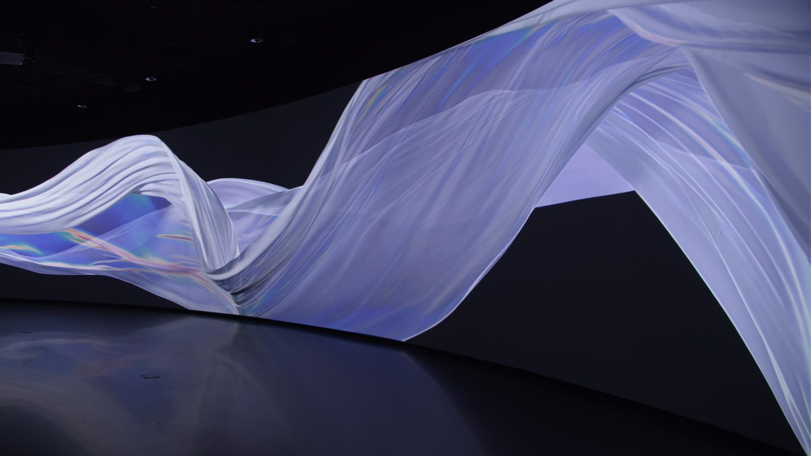
By comparison, here’s the description of Wind: Wind is a work of generative art, as well as a meteorological instrument. Powered by Barcelona wind data, a beautiful banner ebbs and flows across the panoramic canvas, representing a range of data sets such as wind speed, direction, air quality, and aerobiology such as pollen and spore levels.
I also like how the explainers are part of the creative, not something you have to go find or look up.
I just think these efforts are substantially more impactful and interesting to viewers when it has a big Wow Factor, but the audience also knows the context and what’s driving the visuals. Here’s a project video …
Leave a comment