
New Walmart Store Design Builds In Interactive Merchandising Displays
January 28, 2022 by Dave Haynes
The biggest physical retailer in the world has designed digital displays into its newest take on a store look and feel, with flat panel displays and contextual, triggered messaging part of large form merchandising displays.
The tech-centric publication Fast Company got a preview from Walmart of the store design it is testing and tweaking – shifting the focus from pure mission-driven, get-me-in-and-out-of-here-fast shopping navigation to one that does that for core goods but allows time for discovery and experience.
There is also a post about the new design on Walmart’s corporate blog …

The new store design also goes heavy on QR codes – the enhanced bar codes that were supposed to be a big thing years ago, never really caught on, and then saw a sudden, huge uptake in usage because of all the retailing and messaging problems brought on by the pandemic.
The refreshed stores concept looks a bit more like a Target, with product feature areas that are branded and actually designed. Walmarts, historically, have been more about packing as much product as possible on shelves and in bins, than serving up an attractive, comfortable atmosphere for browsing and discovery.
I note this because Walmart is a giant and hugely influential retailer, and what it does sends signals to rivals just in the same way McDonald’s sends signals and triggers actions by other QSRs. For example, McDonald’s was the first major chain to heavily adopt digital displays in drive-thru, and that’s since grown commonplace.
This is the part of the story that intrigued me:
Screens are nothing new to stores; they’ve been everywhere for decades. But despite the fact that most of us peruse the store with smartphones in our pockets, Walmart’s new design features many large, updated screens to offer contextual information.
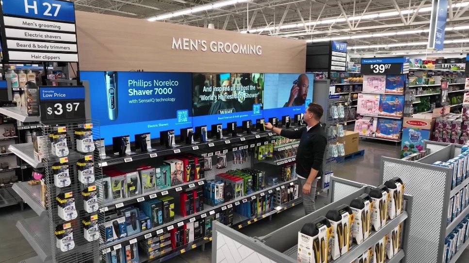
A new men’s grooming section—which was also an initiative pioneered by Target a few years ago—features a super-wide screen over the top of the aisle. The surprise is that this screen is passively interactive. In other words, when you grab a razor off the shelf, the screen will automatically display customer reviews about that specific razor.
So the Lift and Learn concept that’s been promoted for use in digital signage for 15 years or so, but has never seen widespread adoption, now has an enthusiast in Walmart.
On one hand, the piece continues, perhaps you just want to check out a razor without the screen broadcasting what you’re looking at. On the other, Walmart is trying to find the sweet spot of how and when to give a customer the extra details they need to make a buying decision. (So far, Walmart claims that 87% of shoppers in its test store find the many updates appealing, and about half say they’ll shop more at the store as a result.)
Walmart says the design will start rolling out this year, and it typically refreshes 800 to 1,000 stores annually. I assume this is just US and possibly not Canada. The two Walmarts near me have the “classic” design and feel that makes you want to get in and get the hell out as fast as possible. I never feel like that in Targets.
Time will tell, but a hugely influential retailer like Walmart making a big investment in digital merchandising is good news for whoever are the software and display vendors of record (STRATACACHE, maybe???), but also for the broader industry that has been pushing this sort of tactical use of digital signage for many years.
The concept also appears to work in changeable pricing above product displays at the entry, paired with broader store messaging, and that totem on the left hand side of the image below looks digital to me, given the size of the base and its depth. Don’t need that for a printed piece.
Interesting use of lidar I think coordinating product interest and digital signage. I am in progress doing an article on lidar options.