

Walmart Does Big Store Re-Design That Borrows On Airport Wayfinding; Digital Signs Are Minimal
October 2, 2020 by Dave Haynes
Retailing giant has debuted plans for a major re-working on its in-store design that is built heavily around mobile applications, and borrows on navigation and experience ideas from airports.
The new design has very little evidence of digital signage, though there are digital menu boards in-store.
The new concept was tested in select stores and will now be rolling out to some 200 Supercenter stores in the U.S. this fiscal year, and the company expects to have 1,000 stores done by next fiscal year.
This is what the company’s chief customer officer says about the design and intent:
Walmart has been on a transformational journey for several years now, reimagining ways to create seamless omni-shopping experiences that save our customers time and inspire them whether in-store, online or via mobile.
Today, our imagination becomes a reality as we unveil a completely new look and feel focusing on a digitally enabled shopping experience. Developed through a customer-centric lens, the design creates an elevated experience that appeals to shoppers through a sleek design aesthetic, a layout that spotlights products and an end-to-end digital navigation that guides customers throughout their journeys.
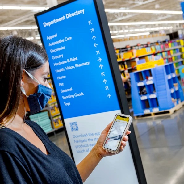
Omni-Shopping Spark & Optimized Entrance: We’ve updated the Walmart signage on the exterior and interior of stores to reflect the Walmart app icon, creating an instant omni-shopping experience in the customer’s mind. As customers enter the store, they are greeted with clean, colorful iconography and a store directory that encourages them to download and use the Walmart app while they shop.
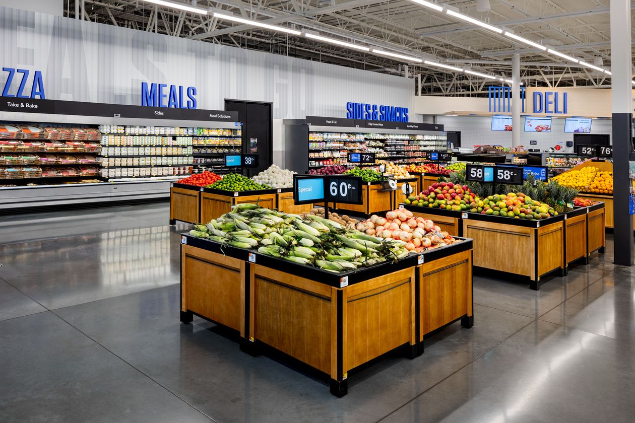
Throughout the store, bold, dimensional typeface (e.g. SEAFOOD, BEEF and DAIRY) directs customers to the exact section they are looking for, while aisles are marked with letter and number combinations to guide customers from phone to product.
By creating a system that acknowledges our app navigation from beginning to end, we create an optimized omni experience for both customers and associates.
Airport Inspiration & Product Spotlight: We were inspired by airport wayfinding systems as best-in-class examples of how to direct large groups of people. We developed simple yet thoughtful designs to replicate these navigation efficiencies, which will help us move customers through the store more quickly.
We also optimized product layout, bringing greater visibility to key items throughout the store, including dedicated in-store sections for electronics, toys, baby products and more.
Contactless Checkout & Payment: Stores will include self-checkout kiosks as well as contactless payment solutions, including Walmart Pay, to limit contact between associates and customers. Select locations will also have Scan & Go to help customers manage their checkout directly.
I’ve been in some nice Walmarts and I have been in a few I couldn’t get out of fast enough. This design is, by the company’s own admission, a nod to how many to most Walmart shoppers are there on a mission, and not to lazily browse and see what they find. That is even more the case in the midst of a pandemic.
Big, bold airport wayfinding was used as a means of helping people find their way around quickly. The smartphone app is all about things like leading you to what you need easily and quickly, and in multiple languages.
Note to Home Depot – which is a nightmare to navigate – do this!!!
I’m not surprised the role of digital signage seems diminished here. The company was a really early adopter of digital OOH networks, with tube TVs dangling above the aisles, when the old PRN was in there.
There is a video of the store in this Fast Company piece (can’t embed, sorry).
Leave a comment