

Has The NYC Nike House Of Innovation Done A Tech Reset After Only A Year?
December 17, 2019 by Dave Haynes
Back in January, when I was in NYC for the NRF retail tech show, I went with a friend to the Nike House Of Innovation store on Fifth Avenue.
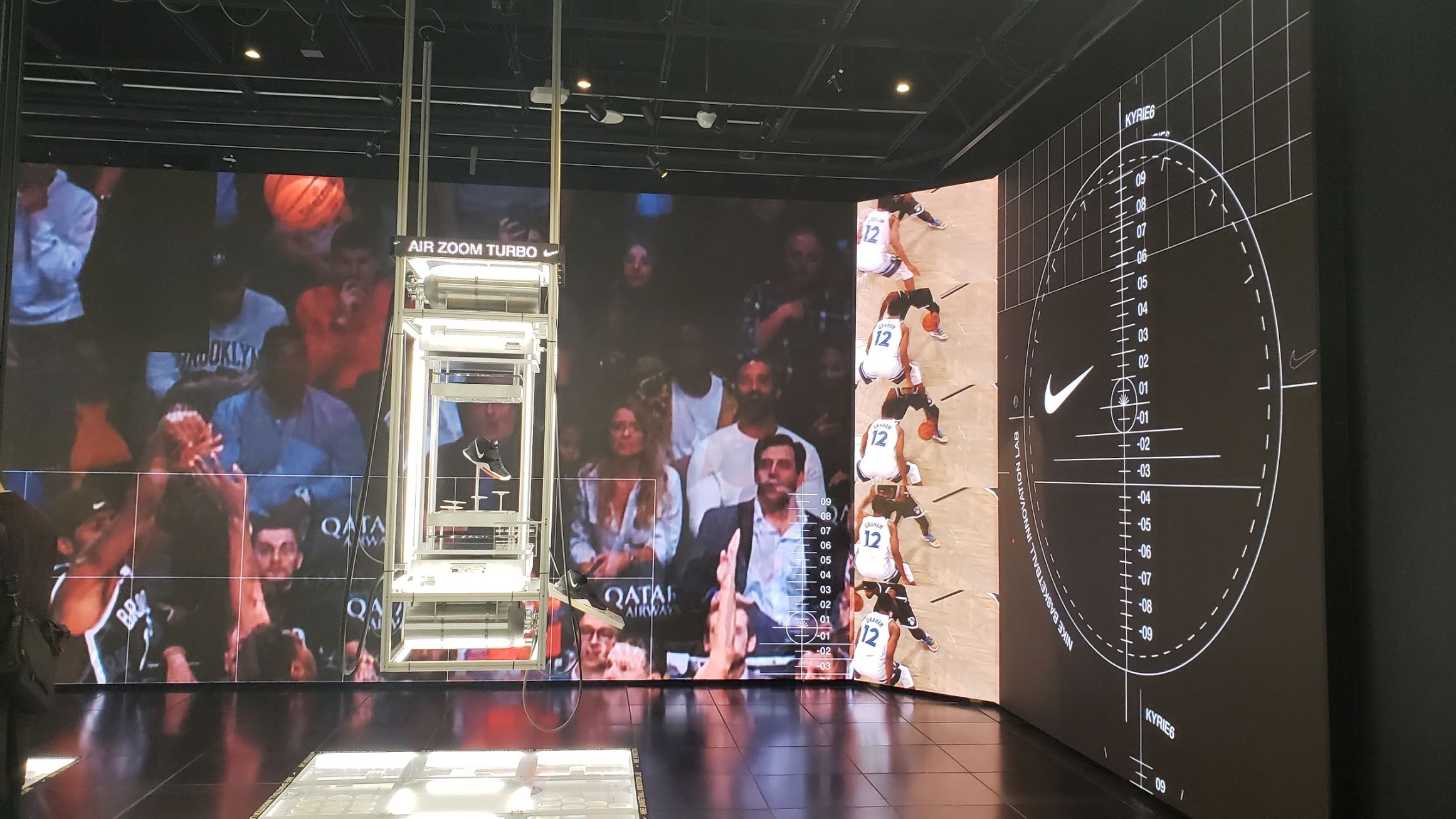
It was very whiz-bangy in terms of lots of screens, off the wall content and a giant sonic tower thingie … which did, ummm, something.
I THINK – really pretty sure – I went into that same store on Friday. And a year after the store opened, some of the stuff I saw back then seemed to be different, or gone.
The main level had a big LED curved wall, but no counter. There was a pair of large LED displays, suspended at angles like suspended TVs at an airport, hanging in the large, open stairwell. But the units were not on. And they seemed to be where the sonic tower thingie was …
This is what that main area looked like back in January. The LEDs were misbehaving, and using white backgrounds did not help.
My question for New Yorkers in retail tech: Has the store already been re-done? (I wrote back in January the screen tech was a bit of a cluster****) Or was I in a different Nike House of Innovation? (Don’t think so).
If it has changed already, I’m impressed. A lot of retailers, having spent an ocean freighter of money on their flagship, would just let it ride for two-three years. Not all innovations turn out as planned or hoped, so the brave thing to do is a design and tech reset.
Anyone know what’s going on?
Side note – I also checked out the Puma flagship on 5th Avenue. Another technical mess. The big Wow Factor Skill Cube thing was offline and a “magic” mirror was down for the count.
What is it about sports retail designers who have a need to go nuts with tech? A cranky NYC friend, who makes me seem like Mister Rogers, recently sent me pix of a Foot Locker flagship awash in dumb parlor tricks like those spinny LED wands (which, surprise, were not working).
Brand image is obviously a huge thing in that sector, but if a lot of that falls on tech, then it has to work and have some relevance and utility for shoppers.
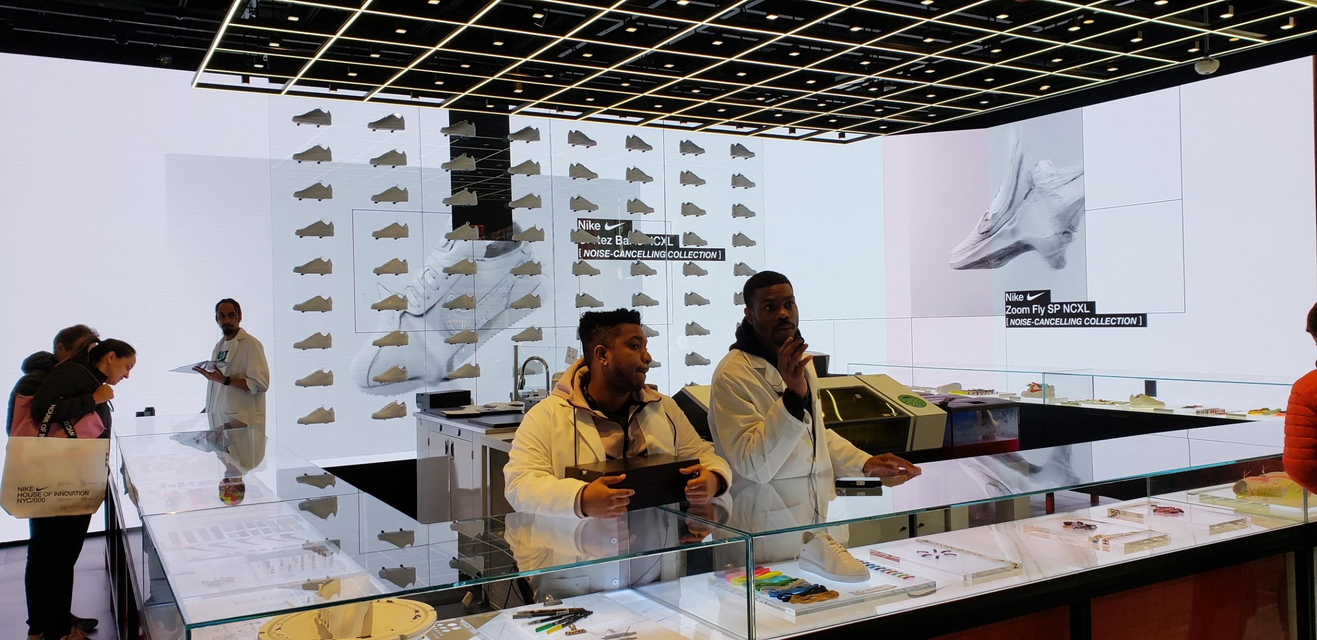
All fair points – but in this case ‘other worldly’ digital components were purpose-built as artistic elements moreso than commercially conventional means. All of which to convey Nike as an Innovation center, and place of discovery, exploration and for pioneers.
the more practical digital elements of mobile shopping, reserve online – pick up in store are what the locals [like myself] gravitate to as it helps leap frog the tourists and get in and out without having to experience the full museum tour.
BUT – for a brand that dominates by design, i also cringe at the exaggerated use of white negative across the LED canvasses – as its both blinding, unforgiving and content no-no. Ouch.