Is Coca-Cola’s Big Robotic Billboard In Times Square Mechanical Overkill For Visual Effects?
September 25, 2017 by Dave Haynes
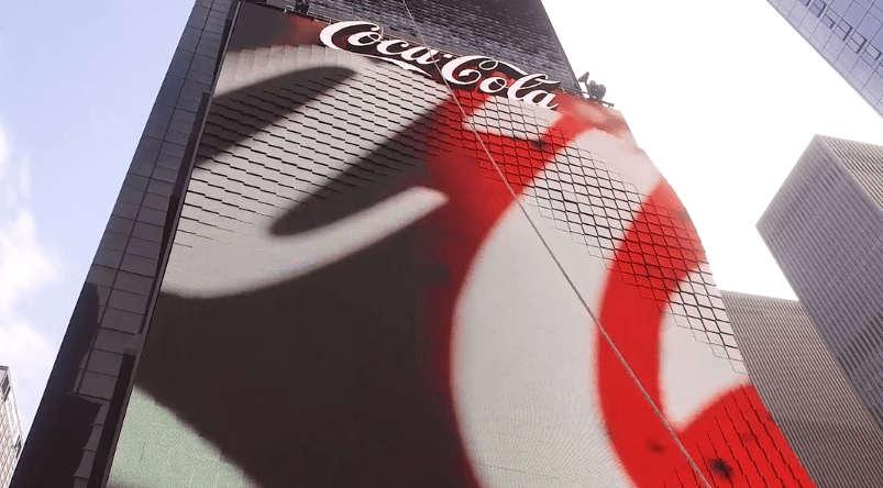
The big three-dimensional robotic billboard that Coca-Cola bankrolled and switched on this summer in New York’s Times Square has generated lots of attention, and led to an interesting debate about whether it’s a brilliant showcase of attention-grabbing technology, or mechanical overkill for effects that could largely be created inside the content.
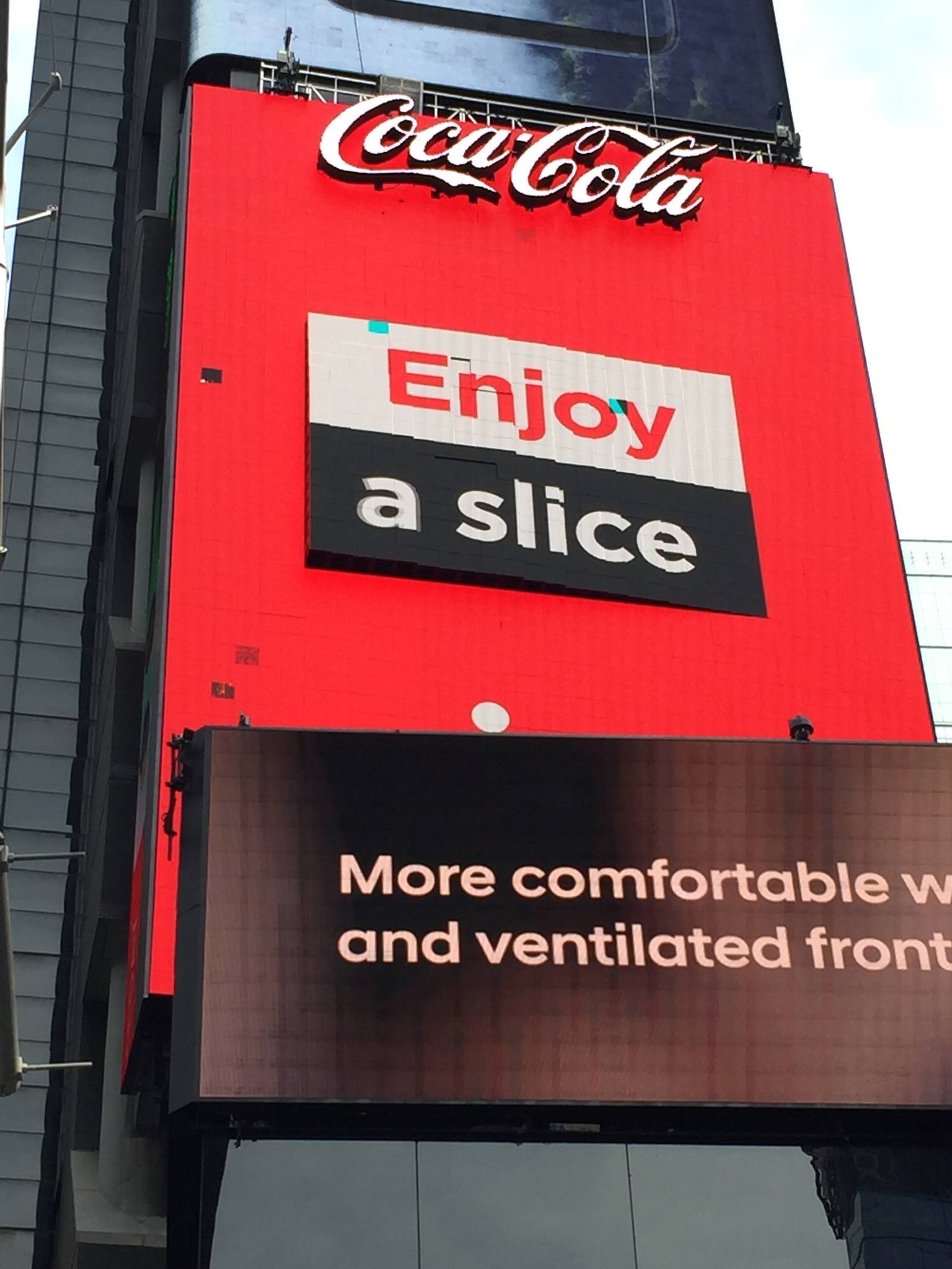
I haven’t seen the board in person, but the (now) many video videos I’ve seen also had me wondering if the interesting rotation of visual effects – swelling, rolling and bulging LED blocks – could be done through clever 3D animations. What I’ve seen online looks terrific, but the old ops guy and consultant in me can’t help thinking about the eternal quest in computing to eliminate moving parts, also known as points of failure. This thing has soooo many points of failure, and I’ve seen at least one early video from an NYC friend showing stick blocks, etc.
Case in point (taken this week):

So I asked a few creative experts what they thought of Coca-Cola’s approach, and got a great variety of takes, pro, con and conflicted.
Denys Lavigne, Christie 360
Part of our responsibility when we develop strategies for clients is about using the right type of screen in the right type of context, as per our objectives for the project. And the connection between that screen/visual and elements, such as architecture and interior design within a space, is an important part of the strategy development. Ideas and installation concepts become a reflection of the opportunities we have to achieve our goals within a space.
I see the use of 3D structures as an extension of this thinking. In this situation, it was probably established that the use of this type of structure would allow that installation to stand out, make an innovation statement and deliver the value that the client was looking for with its investment.
It is a challenging task to differentiate a visual brand experience in an environment such as Times Square, and I honestly have doubts that using clever content creation techniques would’ve been enough. This installation brings a level of fascination that clearly differentiates the brand, and the content strategy seems to leverage the mechanical elements really well.
So from that perspective, I think the Coca-Cola installation delivers the value that they were looking for. And the unique context of Times Square justified the investment and the need to deliver something completely different.
That said, I’m not sure how the mechanics of the systems have performed up to now, and what was done in terms of QA for the systems. My guess is that the client was willing to accept a certain level of risk, and the vendor offered a good deal and a special support program to help him promote this new application, recognizing that this installation could be used as a reference site.
Jeff Doud, MaxMedia
I am not a big fan of intricate hardware solutions in order to achieve an effect. Not discounting the incredible work that GMUNK demonstrated on his BOX video, without a clear conceptual reason to pursue a technical build-out, we would always search for efficiency, value, and meaningful experience. Our goal is always to solve the problem first, and then execute in the most impressive manner possible. Often that means keeping things very simple.
https://vimeo.com/133102952
Complication is easy, but simplicity takes discipline and insight. Thanks to Steve Jobs for clearly demonstrating how effective this line of thinking can be.
We recommend solutions that deliver results that reduce variables, and therefore increase reliability using any and all available methods, media, hardware, and software.
Phil Lenger, Show+Tell
Great engineering and good money wasted. This is the kind of idea that sounds good in a board room but doesn’t execute well. I would bet that the 3D animation they used to sell it shows angles that no Times Square viewer can actually see. A good strategist on the team would have helped to save this wasted effort.
Dennis Hickey, SNA Displays
Some great effects can be produced when combining digital content with mechanical movement. However, the more moving parts you have, the more possibility you have for failure. There’s just so much more that can go wrong.
With creative talent improving dramatically in recent years, creating mesmerizing and optically realistic content on a flat canvas can be extremely effective. Many of our large-format display clients have shown this. An example that comes to mind is Salesforce’s lobby video wall in San Francisco. They have invested a great deal of time and effort to create cutting-edge, realistic content and it was worked wonders for that application. When they first started running waterfall content, people were calling in and posting on social media about how much of a waste of water it was. I can’t think of a better testament to the quality of work on that project.
Randy Byrd, Sensory Interactive
Content is King. Creating content for large-scale LED displays is a unique challenge, especially in an outdoor environment. Content creators with the experience to fully understand the capabilities of technologies and the audience’s perspective from a given view point can manipulate the hardware and software as well or better than introducing mechanical components.
Projects should be designed and programmed around a client’s objectives rather than technologies so that decisions can be made based upon development costs, operational costs and complexities, and the real value that can be achieved by the direction that is taken.
Jonathan Alger, C&G Partners
I love that sign, and buzz is the right word: it’s probably appropriate that a sign for Coke is that over-stimulated.
My prediction? A half-dozen even more caffeinated LED shape-shifters worldwide, until operators start realizing the buzz-kill for their brands when the signs get stuck between repairs. That said, cheers to Coke for pulling off a first. (And yes, I may be biased, but you can accomplish all that 3D goodness, and more, with strong content design.)
Waiting on a couple of other points of view, and will add as they come in. Have your own thoughts? Email them to me at dave at sixteen-nine.net or use the comments tool below …


Usually, I agree that content can do most of what is desired if programmed correctly. In this case, however, if the effect had been only in the content and not had the physical dimension of the install, you wouldn’t see videos posted on YouTube, discussion amongst the trade, or even this blog post. The fact that you have industry leaders discussing it proves its value.
Beautiful content wasn’t the desire, neither was the physical install; the desire was to get attention. And that’s what they got.
While it may be true that the physical effects of the new Coke display could, largely, be created digitally you have to give it up for CocaCola being one the last brands trying to preserve the quickly dying soul of Times Square. They are the last of the dying breed of one sign-one advertiser spectaculars.
All through the last century sign companies like Artkraft Strauss, Spectacolor, and Sherwood built advertising spectaculars that were like nothing else in the entire world.
British Airways built a 1/3 scale SST and put it on a roof, Washington Mutual put a house on a billboard, Camel had a smoking dromedary, JVC built a giant globe. The creativity was a spectacle. It was awesome.
Unfortunately the landlords, city and out of home companies have bowed to the almighty dollar and sucked the soul out of the square. The giant Cup of Noodles and the miles of neon have been replaced with giant flat TV’s playing modified TV commercials. The same TV commercials we can see on TV or YouTube or in the back of a cab. There’s absolutely nothing unique or creative about them other than they’re just bigger. Creative competition to build the next great spectacular has been replaced with “who can build an even bigger giant TV.”
So Coke’s new sign might be a spectacle but it is the only one of it’s kind in the world. That’s what it’s meant to be; a Spectacular spectacle.
It seems like anymore, you almost always need a tech behind the curtain to maintain the experiences… I always engineer enough space for a cot or two in the IT closet. 😉