

Swing And A Miss
October 20, 2014 by Dave Haynes
When in downtown Toronto late last week I had to zip through the retail concourse system to get to the train station, and stopped briefly to look at a new (I think) baby gear store that had signs running in the window and inside.
At first glance, I thought, “Hey, I’m kinda liking the nice, clean look to this creative.”

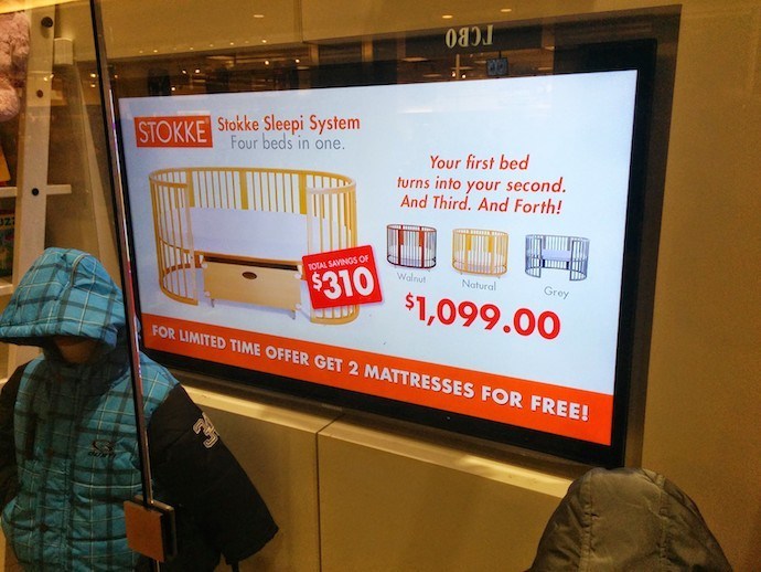
Then I stopped and watched it. The spots are timed for seven seconds before they jump to the next one, and so on. And all the spots – given that timing, or even at twice the time – are too short to get across all the information.
You can get the presentation idea right with big images and big fonts and a consistent look, and then fall down because audience dynamics aren’t really thought through. The designer temptation must have been too great to just get a little more information on each slide, and this feels like good print material shoveled on to another medium .
Seven second timing on a pathway where people are buzzing bu is actually quite smart, but not if you give people too much visual and text information to absorb.
(And yes, I noticed the audio error message. DVD player, I assume).
Leave a comment