
Your Headlines Are Too Damn Small
August 21, 2013 by Dave Haynes

Roughly a million years ago I came up with the notion of office tower retail concourses as a digital media environment, and started a company that put up screens and sold media avails.
It was many, many years too early, something I learned while absorbing the confused or indifferent looks of agency media planners, and watched the steady depletion of my vast riches.

I bailed and “sold” that company years ago (definitely didn’t get wealthy), but the concept has persisted. In Toronto, the indoor concourses that interconnect the forest of downtown office towers almost all have screens. But instead of underfunded goofballs like me touting them, they are owned and managed by big media companies.
That stated, I’m not sure a decade on the format has yet been nailed. But I KNOW I was doing a better content presentation job in 2004 ()see pic at bottom).
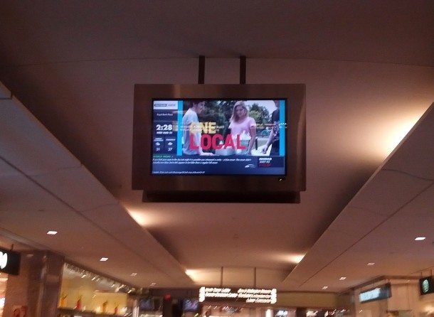
This is Pattison OneStop’s screen in Royal Bank Plaza, one of many that greet more than 100,000 people passing below every weekday as they squirt out of the city’s main rail and subway hub.
If it’s not obvious, the text on the news headline is too damn small. Whether you are walking past, like 99 per cent of the people, or the odd few like me who stop and watch. Which I did today.
Segmented screens are bad enough when you have an audience that’s almost all on the march. But the problem is compounded exponentially when the font size is far too small and the headlines way too long. Most of the other bits are too small, as well.
The Pattison OneStop guys are industry friends, and we have a good debate about segmented screens on subway platforms. At least there, people are standing around for a few minutes. This, on the other hand, just doesn’t work.
Sorry Ian.

Leave a comment