


New Charlotte, NC Office Block Puts Real-Time Data Visuals On Lenticular-Like LED Strips In Lobby
July 27, 2021 by Dave Haynes
A new-build office block in the finance-heavy central business district of Charlotte, NC opened this year with a very different take on using LED to create a lobby experience.
The Ally Charlotte Center uses has a series of animated data visualizations that translate demographic, cultural, environmental, and geographic data into digital art, and does so on a twin set of separated vertical columns.
The project was delivered by the LA-based creative shop StandardVision, which has a heavy focus on big visuals for commercial real estate and corporate.
Says the company in a case study about the project, called Geode:
Geode leverages meaningful local data which subtly speaks to a progressive and inspiring outlook on the quality of life in Charlotte, NC. The colors selected are intended to both complement their corresponding datasets on a conceptual level and create an overall harmonious palette of evergreen content. Expanding the possibilities of holistic design concepts, StandardVision and Crescent Communities were able to demonstrate how Charlotte city databases can create a contextual and relevant centerpiece of constantly transforming beauty for tenants and visitors alike.
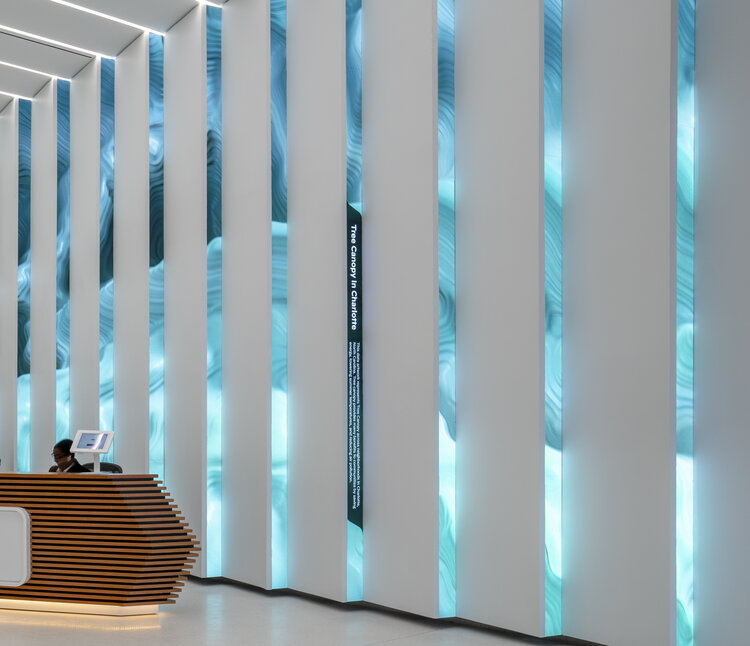
The display is the aggregate 32 custom high-resolution LED digital panel columns—16 on each side of the lobby – connected overhead by a series of linear colored lights. The idea is that the video columns are similar to the effect of lenticular lenses: “The alternating orientations of these angled digital panels create a subtle, mesmerizing, two-way viewing experience that evolves based on the viewer’s angle, perspective, and elapsed time.”
It’s very nice in the stills published in the online case study, but it screams for a video.
One thing I particularly like about this is the explainer built into the vertical content strip. One of the photos shows a headline and text explaining the data set is based on water consumption data.
MOST data visualizations, if they offer any explanation, do so in a little plaque off to the side. So people see cool animations but have no clue about them being generated by real-time data. Putting it into the content, I think, provides some context and, I bet, triggers a lot of conversations that are more involved than “Whoa!”
Where is New Charlotte?