How And Why Universal Symbols Improve Emergency Notice Visuals
March 10, 2021 by Dave Haynes
The 16:9 PODCAST IS SPONSORED BY SCREENFEED – DIGITAL SIGNAGE CONTENT
Suppose something bad happens – like a tsunami or a gas leak – and the alert messaging comes up on TVs and digital signage screens in English text. That’s great, except if much of the viewing audience consists of first-generation immigrants who barely speak or read English.
It’s pretty much the problem, right now, with public alert systems, and a volunteer organization called the NextGen Video Information Systems Alliance is trying to fix that. Called NVISA for short, the body has come up with a way to add universal graphic elements to emergency alerts.
Called Visually Integrated Display Symbology (or VIDS), the system can be adopted across a wide range of communications platforms, notably digital signage.
In this podcast, I speak with alliance member Bill Robertson about the thinking behind these graphical alerts. We also get into detail of how digital signage network operators and solutions providers can plug into the system and put it to work.
Subscribe to this podcast: iTunes * Google Play * RSS
TRANSCRIPT
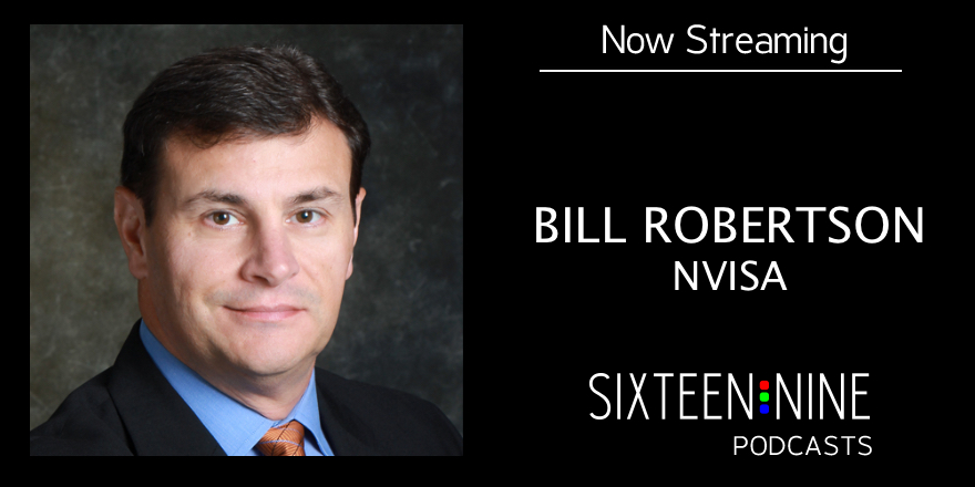
Bill, thank you for joining me. What is the NextGen Video Information Systems Alliance and why did you form it?
Bill Robertson: The NVISA, as we call it is a group of like-minded initially technology companies that had different pieces of technology that were primarily focused at the upcoming ATSC 3.0 broadcast standard. We had different elements that we could use or leverage and many of us that formed the NVISA were members of the ATSC, what was referred to as the “I Team”, implementation team, where we talked about this and helped present some of the elements that are the standards that embodied in ATSC 3.0. We saw more opportunity in getting together and not just being standards based and focused on those particular things, but how could we leverage this? What could we do together as a group, again, of like-minded individuals to be able to represent these things.
And some of it too is not necessarily having to wait until people adopt that new standard, but what could we do today? What could be leveraged with even today’s technology? So the initial start was some technology companies, but more broadcasters and other people have joined the Alliance to help modulator what’s going on, what and how it could fit, what other things we could do.
So it’s been a nice thing about this next gen video thing does not necessarily say that it’s gotta be the next in this type of standards implementation, but what else could we do to improve the whole idea of information?
Okay. So I was interested in this because I got a press release talking about how your organization had put together a series of recommendations for symbols to use for alerts, correct?
Bill Robertson: Yeah, and that was actually our first product in Working Group 1. I was a chairman of that particular group and what we focused on is a recognition that there are things in the broadcast groups in North America, primarily the United States and Canada, where there are members of the community, emergency managers, FEMA on the United States side, whether Canada on the Canadian side, that issue alert information and the alerts can go out over radio, in audio broadcast and they can also go over television. People have seen these in the United States, they’re usually accompanied with different tones to get your attention, to make sure you understand, “Hey, this is an alert. This is information.”
Well, the interesting thing about those is they’re represented in, if it’s a television thing, there’s an oral component and a visual component. We’ve got text crawl, we’ve got audio that’s associated with it. The trick is that those particular things have never been really associated with something that wasn’t texts that had to be read. Or it might be a full screen display that takes over the primary programming and displays what the event is about. But we’ve seen more of a situation where if we could represent those with a graphical element, we could do a couple of more things. Number one, you’re not reliant on them being able to read the particular alert, what it is. That seems a little strange, only in the fact that if English or French may not be your native language, let’s say we needed to represent something to a Spanish community, to a Slavic community, whatever it might be, that if we can use symbols that are more generally understood to represent a particular event that’s happening at that time, we think that is a better way to help communicate.
So it’s not just saying, you have to have the text and you have to have a crawl representation or you have to have a full screen slate, but many times, when you see this, if you see a lot of other symbols, like Stop signs’ got a standard shape for them and people will know what they mean, others signs, things like that represent information that can be conveyed without having to do any kind of motion, without having to display anything else. If we can put that symbol up there, we can definitely communicate.
There must have been a lot of debate around the symbols?
Bill Robertson: There’s some interesting things around that. There actually was a good body of work that was already done. So we leveraged a lot of that and some of these are ISO standards. There’s actually an ISO standard on different societies; it’s actually referred to as societal security emergency management guidelines for color coded alerts. In that standard they represent, okay, “here’s a color code” and we adopted that into our recommended practice. One thing I should point out too is NVISA’s not a standards group. We are coming together as a coalition of people and we’re publishing these kinds of work as a recommended practice. So it’s an idea that, here’s some things that we’ve put together as like-minded individuals and we think has roots not only in this particular part of the industry, but in many other things, again, wherever there’s visual displays and digital signage is the perfect example. Hundreds of thousands of these displays all over the place that could take advantage of a similar kind of thing. And by us mapping these things or looking at these symbols and bringing that together, it really helps.
Another ISO standard for graphical symbols for public information, again, most of these, by the way, tie with hazardous waste or potential electrocution, you’ve seen some of these things as you approach a building many times, those kinds of things, but there’s another group that’s called the National Alliance for Public Safety GIS goes by the acronym, NAPSG and they’ve done quite a bit that goes beyond just electrical symbols or gas, chlorine gas, natural gas, those kinds of symbols that you would put up as warnings to the general public. But they’ve done things to incorporate elements like floods, hurricanes, tornadoes.
And so we leveraged a lot of the work that was done and didn’t just say, “okay, we’re going to take this symbol.” Now some of the symbols, I will tell you, are a little complex if you start to squeeze them down onto a small display size, but they do a pretty good job of conveying the information. A tornado looks like a tornado, the symbol is pretty well described. There’s other things too, where a flash flood looks like a house with waves so you know there’s things going on.
What we had to do was they didn’t cover a lot of the event codes that are used in public alerting. So we had to either craft a couple of things around it, or reference them in a slightly different way. There’s things that can be communicated to the public that are just simply information, for example, a school closing would be an information. It doesn’t have to have a sign that might jump at you and scare you into action, but it’s an informational type of thing. Maybe an exclamation mark or maybe we did a little cloud symbol with an ellipse to say, “Hey, there’s information here, and pay attention to it.”
One of the important things that we did was not just about the symbols, but was also in adapting these ISO standards for people that are colorblind and to reference the symbol with the particular essence of the alert, “is this a really traumatic type of event?” For example, a tornado is a pretty substantive short fuse, quick action type of thing. Your life, limb, property are in potential danger. So we escalated some of these alerts to be represented not only by the symbol, but we added something to the symbol where we did a double underline and that was again to reference this, if I just put up the same symbol, for example, flash flood and flood watch look like the exact same symbol, but by adding a color border around them, we can represent them differently. So red with a double underlined says, “Hey, pay attention” More information to exchange and reference things. “Hey, this is an important thing.” “It’s red.” “It’s got this.”
We also looked at the idea of contrast so that if the font was done in a proper way, and it had a certain speed to it, things like that, but it would be enough contrast. So people that had again, either colorblindness, maybe in the red, green spectrum or other things like that would still be able to at least read the text or be able to discern the difference because the double underline is different than a single underline or no underline. And that’s again, the basis of what we did.
Yes, there was some debate, there was a lot of stuff, but I think we centered on some really good elements that we came up with to really represent what we were trying to go after.
Yeah, I think there are three tiers of alerts. Is that accurate?
Bill Robertson: We actually have five groups and that doesn’t mean that the symbols change but group one, which is the most important one, for example, I use a tornado warning, something that has a substantial impact and again, a short fuse, it’s a very timely thing you needed to take notice very quickly. In group one and group two, we use the same symbols. We use the same color background, but we have a unique thing that we set. One of them is an example. If you were to tune into your TV set and you happened to be watching while the alert is being sent, the typical scenario is that the alert pops up there, maybe we can put the symbol up there too, the alert scrolls by, and then it’s over. It’s done. You switch back to regular programming.
The trick there is that the alert is still active. The alert hasn’t gone away. The fact that you’re still in a danger situation is still there. It just so happens that it just doesn’t show up on the TV screen. So what we’ve done is set up a situation where the symbol would pop up and then the crawl or the text information would be displayed associated with that. Now, when I talk about a crawl, typically on television, you’re familiar with these things, ticker-tape crawls, we went across that kind of stuff. Again, if that symbol pops up with it, you’ve got some association. If it goes away or let’s say you tune in after it’s already displayed, you don’t know you’re under an alert.
So we have a scenario that says: Group one has the symbol and the text displayed together. Group two uses the symbol, but no text. The nice thing about that is, for example, you might have a, let’s say a tornado warning for an hour. You’re in an active storm cell area. You’ve got a tornado warning and it’s active for an hour. So now I can pop up the thing with the texts, say you’re under a tornado warning, but then I can leave the symbol on the screen. It’s not really blocking a lot of other information and programming is still up, but I’ve got persistence in that group too, that says I can leave the symbol up for the duration of the alert, not meaning I know how long the crawl is, but the duration of the alert says, what does the emergency management group say the duration of this event is, and keep it up for that period of time. So we’ve got like a watermark. So it’s using the same symbol, it’s in the same position and everything.
And so when when the crawl goes away or that information goes away, that symbol can persist. Now, this has deeper meaning in the future, that might be a clickable type of link. So here’s an example:say the alerts have already been broadcast, the alert, the audio, everything has already gone. I tune in 10 minutes later. I see the screen. It’s got that little icon up there. I wonder what that’s about. I don’t have to go search someplace else. It could be a clickable link. So on my smart TV or my display or whatever device I happen to be viewing this particular content on. I could click on that and it would take me to a page or to an area where I could find out more information about what that event is, what’s going on, do I need to be prepared for what’s happening?
So that persistence in those really severe alert things really helps us set a standard and I say that loosely in a standard body type of thing, but in a way of representing important information and giving guidance on how it could be used to form a sense of iconography that people could use in the rest of their display technology.
So what would happen if this wasn’t done, or I guess because this is just brand new, what’s happening right now in terms of alerts. Is it just a problem that a lot of it’s in text and it’s just an English?
Bill Robertson: Yeah. You’re going right down that path. The situation that we have, and obviously I’ll speak a little bit more to the United States because of the EAS system in the United States, the primary alerts are done in English. That’s it, that’s the kind of the native thing it’s done in English even if it’s a Spanish station. The worst case scenario is it could be a Spanish radio station and you’re still going to get the alerts in English. And that’s not very good for that audience.
So in the same context you would have English text information on a Spanish channel, so if you’re looking at a video display and all of the programming, all the advertisement, everything else is all in Spanish, you’ve got your target market. All of a sudden, I pop up in emergency information, which emergency managers are really seeking to communicate to as many people as they possibly can. I want you to get this information out. It needs to disseminate to as many people as possible.
And so if you just typically look at the normal things, there’s no sign, there’s no icon. You’re going to get an English text crawl. You’re going to get English audio over a Spanish station. That’s not very good in really trying to communicate what’s going on and to whom they can really discern that information and take action on it. The idea of this alerting is to be able to know whether you need to take action and what type of action you need to take. Typically that’s described in these alerts, that’s an important situation.
So the idea is if we can take this stuff forward and people start to adopt this “VIDS” idea or this visual information display symbology. That’s how we’ve coined the term VIDS to represent and do a better job of leveraging the stuff we’ve already vetted out. We vetted out the icons we’ve done the colors. We’ve done a lot of other things. It doesn’t mean people couldn’t modify that if they want it to, if there’s something that they want to present a slightly differently, perhaps for a station ID type thing, but it’s really to help bring this together. Bring this symbol that is universal. If there’s no language issue with presenting the symbol and therefore it can be more easily discerned by people that don’t have that native language skill or a may not be able to read the text, may have a visual impairment about reading it, or don’t have the language skills because it’s done only in one particular language.
And I assume it’s important to have everybody on the same page in terms of the symbology use, because if you have five ways of showing a condition, you’re just causing people to look at it twice and go, “okay, what does this mean?”
Bill Robertson: Exactly and that’s why, again, what we did is, we didn’t invent that. It wasn’t an idea. In fact we loathed the idea of trying to build graphic symbols because a lot of the stuff was already done. It’s “can we leverage them?”
And by leveraging the stuff that’s already out there and doing a little bit of improvement in what we think is by adding the double underline, so you can differentiate both the elevation of the alert, because again, the symbols could be the same in a flash flood and a watch, which isn’t as meaningful or impactful if it was a flash flood warning that, that’s the next step up.
So that actually by the way, ties back into the group. So group one is the event codes or the event information is displayed with a symbol. Group two is the symbol-only to persist for those really important alerts. And then we go into group three, which has a yellow color again, focusing on what we should do for cautions or warnings and types of things. It uses a single underline under the symbol, again, to differentiate it, so we know where we are with the symbol, and represent that in terms of, “Hey, this is something of importance. It’s not as critical as a red alert, but you’ve got a yellow alert.” So again, that color coding, we think is important. There’s blue that we do with some symbols and most of the blues are done as informational types of things. Again, it’s not a critical life/limb/property type of event, but it’s something that’s informational. Again, school closings or a road closure someplace because of Some kind of construction thing or accident even as it may be.
And then the final one, is group five is a green background, no underline under the symbol. And that’s really, again, a level of information, but they’re typically for tests. So this is just, you could in essence, ignore it. “Don’t worry, it’s green. Everything’s okay. We’re fine.” It’s just up there to help say, okay, I can’t read the text, but I understand this is just a simple message. No action necessary.
So I’m an end-user with a digital signage network of some kind, let’s say on a university campus, or I’m a digital signage software vendor, or a subscription content service as well.
How do I use this? How do I plug into it? What are the implications of operating it?
Bill Robertson: We’ve had a couple of companies already implement VIDS in their character generation devices. One of our partner companies in NVISA has done this and we actually have some examples of what this looks like, which I can send you the YouTube video links I think would be very nice because again, when people see it, in a classic sense, a picture tells a thousand words and so they can see it and they get a better understanding of what these different types of things look like.
But for the content providers and especially the digital signage network, we would love to see them adopt this similar thing. And there’s a couple of things around it, but again, the symbols are there. We have them available in JPEG and SVG format so they can grab the symbols. We’ve gotten the table already built for what event codes they’re associated with. So we’ve done a lot of the groundwork. All we need is more people to gather the information that we’ve already provided and adopted into their product.
The one thing that they will need in that environment and we’ve seen a lot more of this, and this is coming from my work, let me say my day job at digital alert systems,is we build the devices that listen for the event codes, that listen for the emergency managers and even in some respects the emergency managers use our equipment to generate the alerts that go out over the air, over the internet. And when we receive those, we can pass that information into the signage systems, into the character generators, into those things. So in other words, for the most part, they’re doing their normal thing. They’re showing and displaying the content that is already set up for that sign. if it’s a map in a mall, if it’s a menu in a restaurant type of thing, whatever it may be, they’re doing their normal work. We can send them a message over IP that just says, “Hey, if this display is in this location, given some geo coordinates about where it might be, then here is the alert that you’re currently under.” And Dave, part of the stuff that I look at around this is there’s an idea that in college campuses and facilities, enterprise facilities that have a lot of signage around in their particular campus areas, they live in what I call a hyper bubble.
So it’s a hyper-local bubble there. They’re sitting here and they get information and they exchange it inside the building or inside the campus. There’s not a lot of recognition of events that might be going outside that could impact them. Again, there’s a lot more of these and we’ve been doing a lot of work in my day job about facility managers and other things about adopting this type of technology, because if I’m in that environment and what’s really good, is these signage elements have a great way to communicate. It’s fast, it’s a great way to communicate, you can get very impactful messages, and when I say impactful, I’m talking about again, just because I get an alert, what I want to do is know, okay, I’m under an alert, but what should I do? If it’s a gas leak, is it chlorine gas or is it natural gas? What should I do?
Those things all come into play about information that you can exchange about these. Plume maps, there’s a whole range of different things.
If we can then pierce that hyper-local bubble and bring in information. So for example, a campus is part of a city, part of a County, part of a state, and there may be events that are happening across that entire environment that they need to know what to do and if we can bring that information in and transfer it into those signage components and it’s in a form that’s not only well known or is going to hopefully become more well-known in the typical broadcast community and cable casting community, then these people will recognize, “Oh, okay. I see it. I’ve got an alert information and I can display it.”
That’s using an interim box of some kind that’s sniffing for all that stuff. What happens right now, if I’m in a jurisdiction where there’s an Amber alert, or if there is some other kind of public safety alert, that’s pushed out to smartphones and to broadcasters and so on?
Are they also using some sort of an interim device or is it just sniffing like a data cell or getting something triggered out to it that causes a message to pop?
Bill Robertson: There’s a couple of different things because, in the United States and Canada, the United States has what’s called FEMA, the Federal Emergency Management Agency, but they have a server that is called IPAWS which stands for Integrated Public Alert Warning System (IPAWS) and it uses a technology that’s called CAP (Common Alert Protocol). Again, we’re talking about the government, so there’s going to be acronyms.
There’s a similar type of thing that is run by a private company in Canada, and that entire methodology of alerts go through those kinds of clearing houses. Now the important thing too, is not every alert goes into those servers. In a local thing, let’s go with some Teton County, for example and I want to generate an alert, it might just go out over the air and the sheriff there generates the alert. It goes out over the air. It never goes and sees IPAWS. So you can have some local ones and if you’re not watching for those, you may miss them, but there is this idea of these integrated servers in Canada and in the United States.
The problem is those devices or those servers serve a ton of information because there’s a lot of agencies that are on them. What you need to do is to act correctly and so at every television station, every radio station, every cable head-in, there is this intermediate box that its job is to listen and monitor those things and it’s also set up with a set of filters. So it’s looking, saying, “okay, I’ve got all of this information, but is it important to me?”
Number one, does it rise to the level that I’ve set? I’m not going to get every alert and broadcast it, then you end up with a really bad situation of just constantly crying Wolf and no one pays attention to it. So the idea is to have a device, an intermediate device that monitors this feed, these feeds, and it says, “okay, is it for my area? Does it rise to the occasion that I need to pay attention to it?” And if it does, I basically need to decode that and turn it into text and audio because many times, for example, the ones in Canada, they don’t come with audio. We actually use a text to speech engine to create that, and cause it to create the audio for the particular message.
So the nice thing about that is: that capability that idea of having this intermediate device is to monitor, to look and to format it, so that the downstream devices, the character generators, the digital signage content only have to react to what we say is important because you preset it for what values you want and it has all of the information necessary for that. Here’s the text, here’s the audio, play this, represent it this way.
So in a lot of circumstances in the digital signage world I would say 80, 90% of the networks that are out there are running as software as a service. So the end users may be using a service that is used by hundreds of other companies.
Does the central digital signage software CMS company need to have one, a listening device for all of its networks or one for each of its networks, or how would that technically work?
Bill Robertson: There’s a couple of different ways to do it and it’s not dissimilar to the way that a lot of cable and even some broadcast companies have done central casting. So they’ve got remote locations, transmitters set up in one city, but they’re actually being fed content from another remote city.
Depending on the level of engagement, and the reason I say that level of engagement is in the United States, the FCC says that you have to have very specific standards. In other words, there’s a requirement that says you must monitor off air signals and you must monitor the FEMA iPAWS feed. Again, that’s under the purview of the FCC, for example, or in Canada, the equivalent situation where you are required to do that. In an area it’s not a requirement, you can phase yourself into that and that way, if the central CMS system has the capability of discerning, “If I send it to five areas.” And in Canada there are SGC or special geographic codes in the United States. It’s they’re called FIPs codes, very similar to ZIP codes so that you’ve got an area that is defined.
If I send 10 different area codes, let’s just use that as the idea. If I send 10 different area codes to the CMS, then the digital signage content management system is able to say, “This is an alert for this area code and I can send the alert information only to those receiving points.” So if I have the capability of breaking up my content or the alert going into those receive points, then you can do it in a central point because I can assemble it back to that central point, I can send information out and it’s a great way to do it. It really is going to be dependent on kind of the design typology and how much addressability that CMS provides for different locations.
All right. So if I am, again, an end-user or a digital signage solutions provider of some kind. I’ve read about this, I’ve listened to this podcast, and they’re interested, what do they do?
Bill Robertson: One thing that they could do right now is they can download the VIDS document the recommended practices from the NVISA website that’s www.nvisa.org and so if you go to the nvisa.org website, you can download this recommended practices and the symbology. Once they take a look at that and understand what we’re talking about in the context of the symbols and things like that, we can make available the symbol set, we’ve got that available for them, and we can talk to them more about specifics on integration and then some of the other companies that they can talk to about how they would be able to assimilate that information, get it into their displays, where does the information come from? How was it received? What protocols are used? And that kind of stuff. So we can take them through a number of different things, but I really would encourage them to take a look at our recommended practices.
One of the things that we did in the practice document is make sure that it wasn’t based on things like scan lines or pixels but really is a ratio, it’s a relationship because if it’s a 16:9 display, or if we rotate it for a vertical presentation where it’s 9:16 or something else we want to be able to have the the icons and these text types of elements in the same relative position. Again, if it’s a smaller screen, I’m not giving you fixed sizes for the number of pixels, there’s a ratio of banner height to symbol height and that’s an important distinction too, so that we can be very flexible in whatever format the display might be.
All right. That was terrific. Very interesting stuff. Thank you so much for spending some time with me, Bill.
Bill Robertson: Dave. Thank you very much. I appreciate it.
Again, if they just visit the www.nvisa.org website, take a look at the documentation, give us a shout, let us know if we can help!
(Not so) Random musings: Iconography is nothing short of a new (and rapidly expanding) language. But I do have a couple of concerns on this quest for “universality.” The first is: Somehow they never are “universal” … think of the different meanings of swastika, the ‘peace’ symbol, the skull & crossbones, the ‘ok’ hand sign … even “stop” signs can be different, though most countries have adopted the octagon (itself a symbol with multiple meanings) and that is the single MOST recognized traffic sign. The second concern: iconography eliminates the written word and therefore deeper communication. It’s one thing to have the picture of a Big Mac on a POS screen; it’s quite another to try and create icons for more complex concepts, like medical screening (see the movie “Idiocracy”). And I can’t help but be reminded of the newspaper in “Fahrenheit 451″… all pictures. This is the visual aspect of the larger problem of trying to create “universal” gestures for contactless interactive screens. Just Google: ‘different hand gestures and their meanings’, you’ll see… Be careful what you wish for.