
Nike’s House Of Innovation In NYC Great On Experience, Terrible On Screens
January 16, 2019 by Dave Haynes
When I was at the NRF show this week in New York, I bumped into numerous industry friends – some who encouraged me to get away from the exhibit venue and head over to the new-ish Nike “House of Innovation” flagship on 5th Avenue.
It was mind-blowing, I was told. So I grabbed an Uber with a friend, Raffi Vartian from Diversified, and went over to see what all the fuss was about.
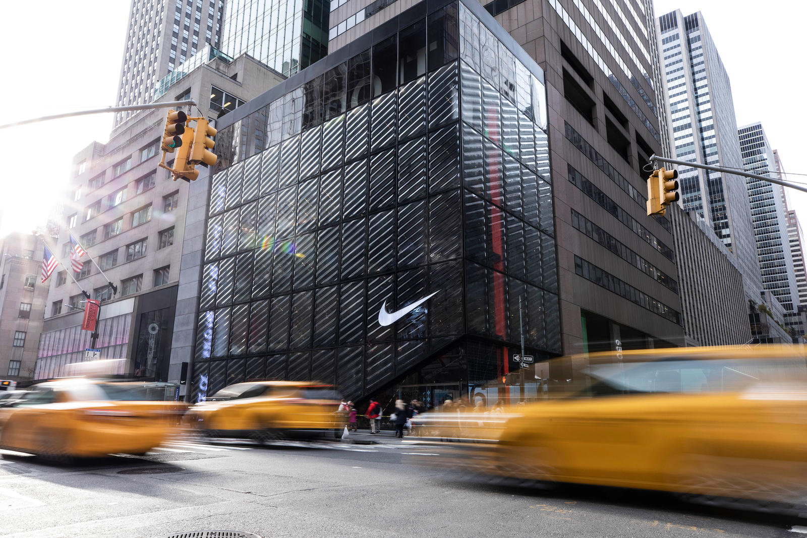
It’s pretty amazing in terms of delivering on customer experience, and bridging mobile to bricks and mortar. But the technical execution on the signage is kinda terrible, particularly since the store has been open all of eight weeks.
Nothing wrong with the software (I am told Nike store screens are powered by Nanonation), but the display design and quality is sloppy.
The signature direct view LED wall in the main lobby (see top) had drifted out of calibration – one huge block was pinkish instead of white – and another set of modules was black. There were dead pixels all over the place. Nike is a huge brand and it is just plain weird to see something that would have cost serious six figures look that shoddy.
I just can’t imagine anything looking this bad in an Apple store, for example.
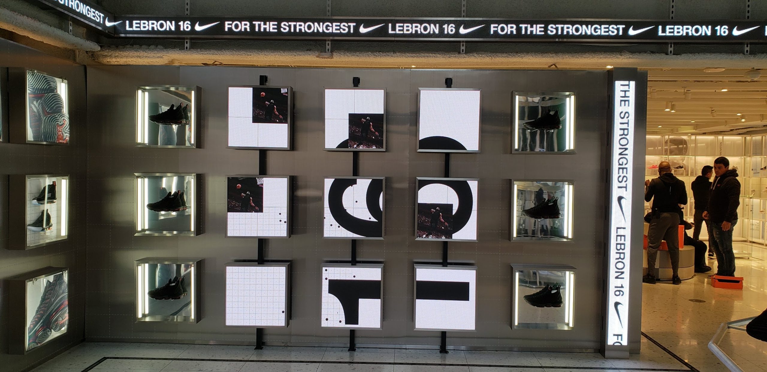
The squared-off signs used up on one level were noticeably low-rez LEDs – which may have been a street/grunge thing that’s purposeful. But it doesn’t look so hot.
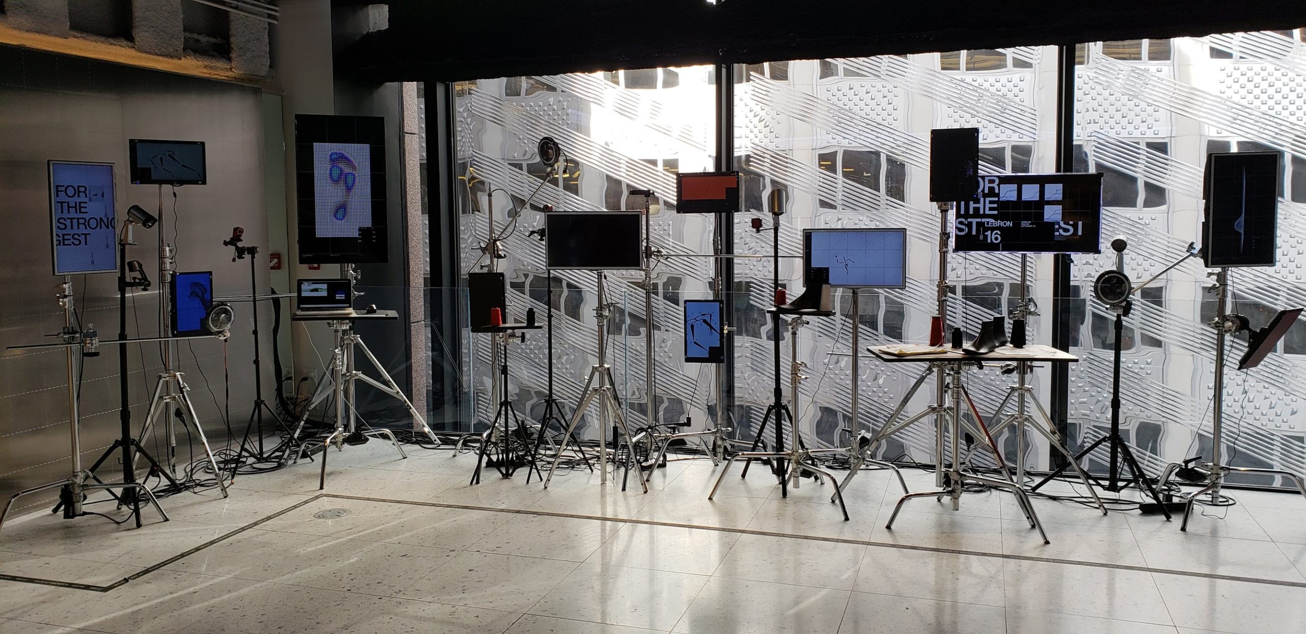
There is another area that is a bunch of disparate screens on lighting tripods that has that smell of somebody saying, “Hey Walt, go out to dead storage and find me, like, 20 monitors, and some stands. I have a thought.”
I didn’t see the point, some of the screens were out, and to me, at least, it didn’t fit and doesn’t work.
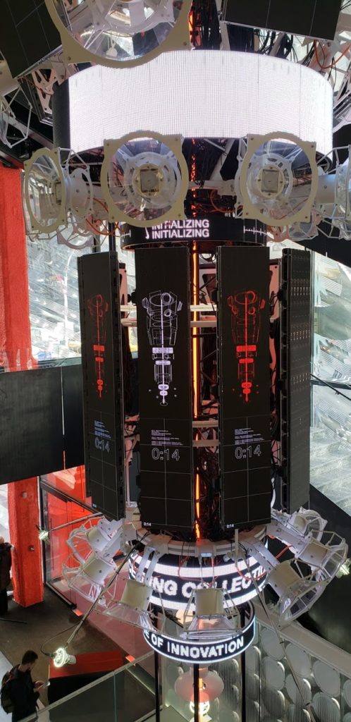
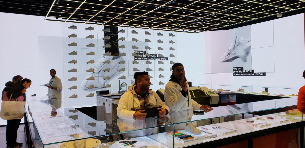
The sonic tower thingie with hi-rez LED panels and dynamic is audio is cool, in a “What the hell is going on?” kinda way, but people in the store were far more attracted to the glassed-in lab room where people were designing customized shoes. They were looking in there, not up at the cryptic stuff on the sonic tower.
I did like one area that had LCDs built subtly into mirrors, for messaging.
Overall, there’s no question that Nike’s design team put together a store that is as much about delivering on experience and being a destination. But whoever did the screen tech should be a little red-faced.
Leave a comment