

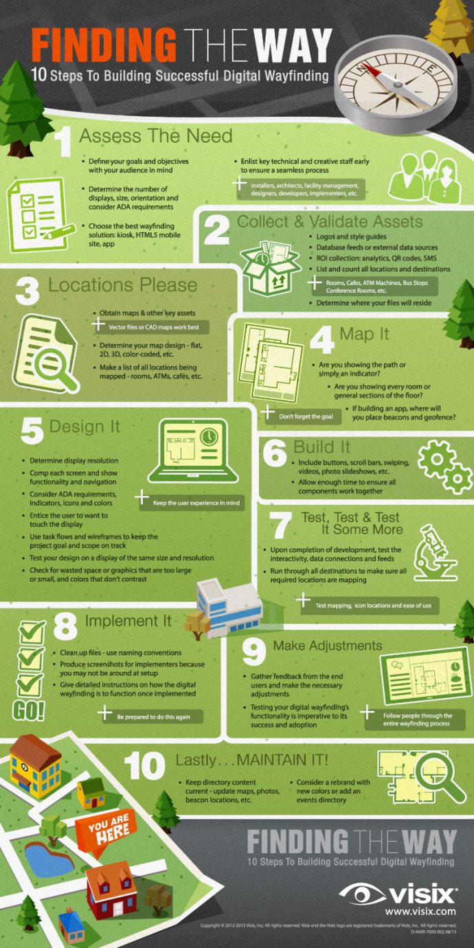
10 Steps For Planning Successful Interactive Wayfinding
August 16, 2018 by guest author, sixteenninewpadmin
Guest Post: Jill Perardi, Visix

Jill Perardi
When it comes to wayfinding options, interactive signage is the most flexible and powerful way to go. But each location is different and presents unique challenges. Before buying anything, think it all out and come up with a good plan to help make the process as smooth as possible:
1. Assess Your Goals
This might seem obvious – the goal is to get someone from one place to another as efficiently as possible. Yet different types of people will respond to different things.
Think about your audience, what their experience with digital wayfinding is, and what appeals to them. You want to have exactly the right amount of information on the screen – not too little, or no one will be able to get anywhere, and not too much, or people may become distracted and confused.
Come up with a clear plan based on thoughtful consideration and keep that plan in mind throughout the entire deployment process.
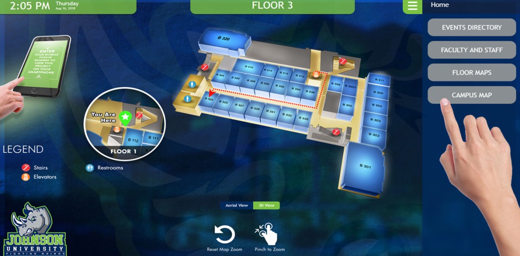
2. Consider Displays
Will they be portrait or landscape? Design for that orientation. Landscape is great for having a map plus directories on the side, portrait is better for tall maps (and directory buttons can be under the map).
What about ADA compliance? This is especially important for facilities that have a lot of visits from the general public. Because you really don’t know who exactly will be using the display, you should probably err on the side of caution and make sure everyone can use it.
Where should they go – next to entrances, in the lobby, in corridors? Place displays anywhere people might need a little help getting around. If there’s no space for a large wall-mounted interactive screen, put I smaller one in a freestanding kiosk instead.
A small display will only be able to display a small map, which might not be ideal for visitors with vision issues. On the other hand, a really large display might make people have to back up to see all the information, and now they can no longer interact with the screen.
You also need to think about things like light in the space throughout the day (a display is all but useless when there’s direct sunlight on it). Also consider where people naturally go when entering the space that holds the display, and where their eye naturally falls. It’s one thing to say, “put one in the lobby”, but where in the lobby is the best spot? Maybe you need two or three displays in a busy location.
3. Gather Your Team
Who in your organization will be involved in the process? Design and branding will probably be under marketing and communications. Facility managers (and maybe even architects) will have something to say about the physical building. IT people will need to integrate databases, run maintenance and deal with issues like wiring and firewalls (if connecting the displays to the web).
Don’t just think about getting the project off the ground. Determine who will test the system, get feedback from audiences, and make adjustments or updates in the future.
Be sure to get everyone involved early so you all understand the goals, timelines, responsibilities and resources involved. It’s also good to get early buy-in from everyone so they feel included and excited about the project.
4. Catalog Your Assets
You need to know exactly how many things you need to put on screen. How many buildings, floors, rooms, people, etc.? If using directories, how many items in each one? Where are common meeting points that people might naturally want to get to? What about landmarks (restrooms, ATMs, cafes, bus stops, etc.)?
You’ll need to do an accurate count and have those lists ready when you shop for a designer. Each element you add later can mean additional charges.
5. List Data Sources
Will you use databases or other external feeds to push content to your displays? If so, what issues might arise when trying to integrate them? Are there firewalls to get around? Is there space in the screen design for this information? Does the information update automatically or require human intervention? Where does the information actually live and who maintains it?
Whoever is coding your digital wayfinding will need to know about all of the external sources that might feed it. If updates aren’t already easy, you might ask if they can build a user-friendly interface to make changes. That way you don’t have to pay a vendor each time changes are needed.
6. Concept the Look
Your wayfinding design should probably match the look of your brand. If not, you at least don’t want things to clash. Look at the actual spaces the displays will be in. Do you really want to use that shade of blue on displays in a room painted orange? The interactive maps can also mimic the look of your facility and interior décor. Are your floors color-coded? If so, think about mirroring that on the maps. This will make actually navigating the space easier for visitors.
You don’t have to design your look – just be able to communicate your brand standards and design preferences to the vendor. Having some sample images of wayfinding you like on hand can really help the designer to know your tastes.
7. Focus on the Visitor Experience
What will people see when they first approach the display? That’s going to make a first impression that could determine how willing they are to use your wayfinding. Reduce the number of steps needed to get the information people want – if someone has to go through five different levels of information to find a conference room, they’ll probably just give up and ask somebody (which defeats the purpose of your digital wayfinding).
Consider using a timeout screen that resets to a sort of home page when the screen has been inactive for a set amount of time. This helps standardize that first impression, plus prevents image burn-in on your screens.
Make sure that the way you label things on your interactive maps is the same as the actual spaces. If a room’s door calls it “Conference Room 1”, then say that on the map as well, and not “Room 1”. One thing that’s certain is that you want everything you show visitors to be consistent. You are essentially training them to use your wayfinding system as they use it, so make sure it all makes sense together.
8. Prep Your Maps
Maps will often be CAD or vector files, but you will probably have to turn off layers that you don’t need (like electrical wiring). Only show information people need to get to where they’re going.
Think about what kind of map designs you want. Many places are using 3D design these days, and this looks great. But if you have a lot of rooms of locations, it can quickly become cluttered looking and overwhelming to the eye. In that case, maybe think about flat design instead. You can also have options on screen to switch between 2D and 3D. Remember that the look you use should be all about making the wayfinding easy.
Also, consider how many maps you need based on a typical visitor’s route. Do they just need to see the floors for the building they’re in, or might a campus map be useful for going building to building?
9. Plan Routes
So, what will the map show? You could use indicators – one for point A (“you are here”) and another for point B (where they are going). But maybe it’s better to show the actual route using a static or animated line. And once those indicators or routes are displayed, what happens to the rest of the map? One option is to just add the A-to-B graphics to the map, but you could also have the non-essential information “ghost out”. Or have points A and B flash.
What happens if someone has to change floors to get to point B? This is one place where having an animated route path can really be useful: the path goes from point A down the hallway to the elevators, waits a moment (maybe flashes twice), then the screen changes to the correct floor and the path continues until it gets to point B.
10. Consider Takeaways
What happens when someone walks away from the screen? Do you want to duplicate your wayfinding on the web, or let people download maps and other information to their mobiles? If so, you can include a QR code on your maps that leads to a webpage, PDF or HTML5 version of the entire wayfinding project that will size to their screen.
If directions can get complicated, consider including an SMS option that will text turn-by-turn directions to the visitor after they choose their path.
Summary
Once you’ve done all this work with input from all stakeholders, you need to create a detailed project spec to present to vendors. Once you’ve chosen a designer, worked through several stages of concepts and created your wayfinding project, you still have to implement it, test it, adjust it and then test it again. Only then will you be ready to go live.
Without a detailed planning stage, you’re in for some serious headaches as unanticipated issues crop up and cause you to spend more resources and time dealing with them. Of course, there will always be surprises during the process (that’s why you test several times), but chance favors the prepared mind. So, prepare yourself by coming up with a comprehensive plan before you do anything else.
Leave a comment