This Wild Data Visualization Shows Traffic Flow For Entire U.S., Hour By Hour
January 11, 2018 by Dave Haynes

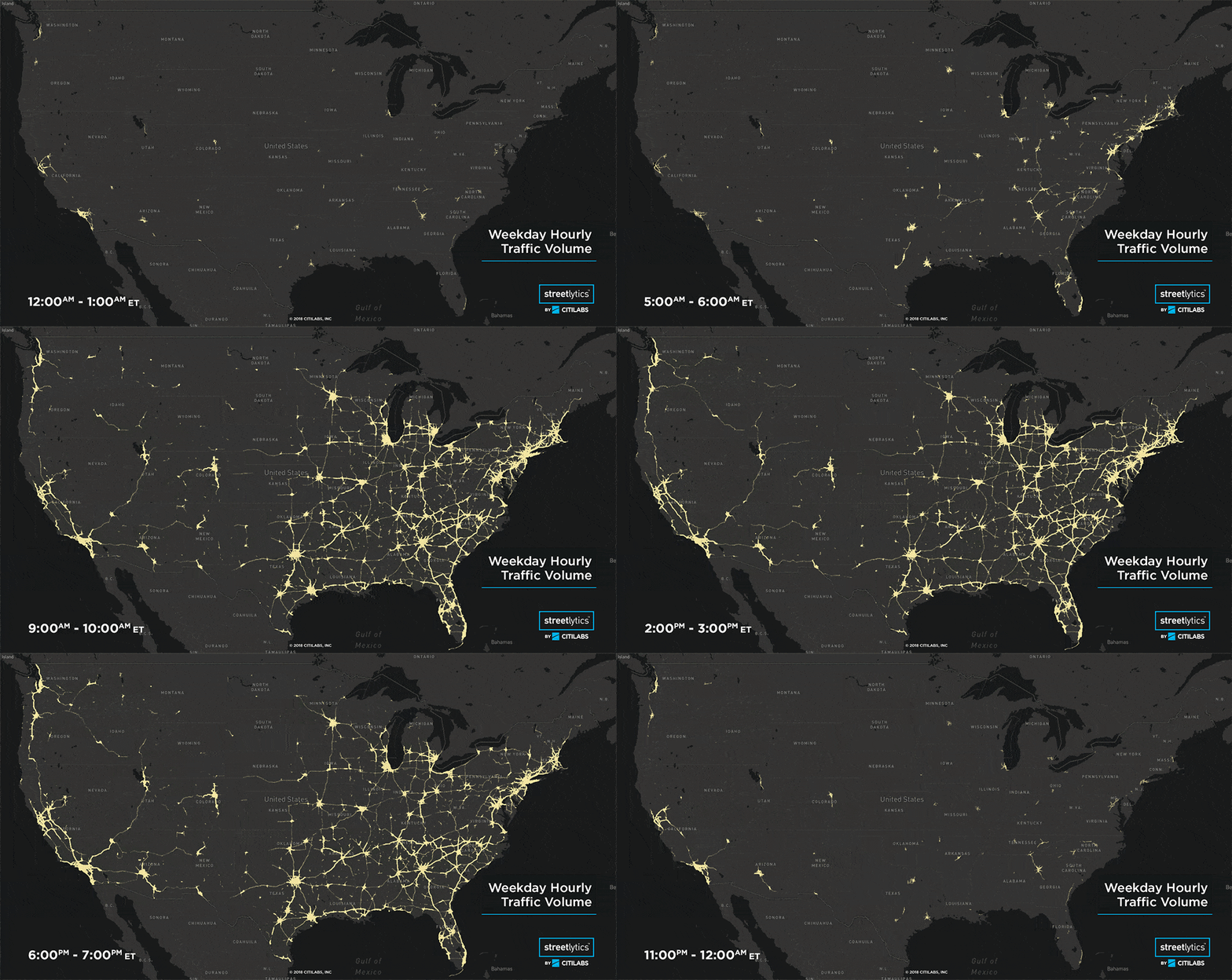
This is kind of wild – a visualization of traffic flow across the U.S. – hour by hour.
Sacramento-based mobility analytics solution provider Citilabs has used billions of data points to measure and then develop a graphic visualization of hour-by-hour origin-destination movements, all streets directional road volumes and traveler demographics based on derived home locations. The map (big one here) shows the intensity of traffic volume on roadways in the continental USA by hour for an average workday.
I know … cool, but so what?
Two things:
1 – it’s the sort of data visualization, once you start drilling down to local levels, that directly helps inform things like digital OOH advertising. When you have a good idea of traffic flows and who all is in those cars, you have a better idea of where to put media faces and where brands will best reach their target audiences.
2 – this sort of thing shows what’s possible with visualized real-time or archived data that is visually interesting, but isn’t just art that looks pretty. There are more and more generative data-driven video walls out there that look amazing, but almost no one would understand what they are looking at is shaped by data.
“Citilabs is excited to release this first visualization of comprehensive traffic flow in America,” says CEO Michael Clarke. “Streetlytics provides the understanding of population movement both from place to place and on, and within, our transportation systems. As we prepare for a time of extreme change through technology in our transportation systems, it is key to designing the solutions of tomorrow.”
I did a podcast recently with Clarke, who goes into this stuff without nerding out. You’ll “get” what he’s talking about.


Leave a comment