


Cool Data Visualization Shows Global Shipping
April 28, 2016 by Dave Haynes
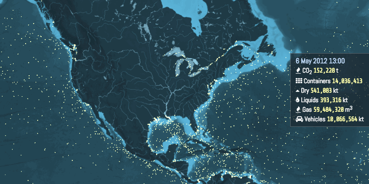
The University of London’s Energy Institute created this great visualization to show the movements of cargo ships, and the resulting carbon footprint. This is just a gif of that. You can (maybe) see the full visualization at http://www.shipmap.org/. You’ll need to enable Web GL support in your browser, which takes a little rooting around to get sorted.
I mention this because the data viz work is a great example of what could be done and shown on a large display or video wall in a corporate environment. For a shipping company, the application is obvious. But this sort of thing could be done for any form of transport – from Uber to airlines – and for other types of companies, like logistics or car rentals.
You establish the data sets, build the visualization, point to that data, and when the data is refreshed, so are the visuals.
Leave a comment