


DSrupted: Mike Pell On Data Visualization And The Age Of Smart Signage
July 10, 2015 by Dave Haynes
I’ve written quite a bit lately about how data and particularly data visualization can and will play a large role in some future signage projects, and Mike Pell of Microsoft is coming to DSrupted in September to reinforce that, from the point of view of an expert.
 Pell speaks regularly about data visualization and has a terrific knack for explaining not only how it works and can be used, but how it needs to be done properly, to have any tangible impact.
In researching data visualization in the last couple of years, I’ve seen countless examples of visuals that looked amazing … but I had no idea what they were supposed to be telling me.
A senior designer amd “envisioneer” with Microsoft, Pell will talk about the beauty of visualizations, but also the absolute importance of clarity. If you are working in or with corporate communications, selling video wall technology, or design spaces, this talk should be worth the DSrupted ticket alone.
Here’s a Q&A with Seattle-based Pell:
Q: Data visualization can be many things. How do you define it and if someone asked for a descriptive example, what would that be?
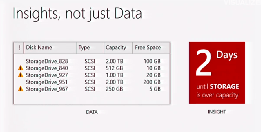
It has a very broad definition these days, so perhaps I should answer with what I believe great data visualization does best – conveys a key insight through a quickly understandable shape or form that was synthesized through a deep understanding of the underlying data set. Or simply put, Visualization surfaces Insight.
The best examples of data visualization look seemingly obvious and are deceptively simple at first glance. But, rest assured the good ones were carefully considered. Some of the most striking examples of surfacing insight from a dense dataset tend to involve spatial representation over time. For example, it’s one thing to form a mental model of how many commercial airline flights happen to be in the sky above us at any one time from a columnar listing or spreadsheet, but it’s quite arresting to see a highly visual representation of their paths animated as crisscrossing flights overlaid on top of each other forming a dense mesh. The impact is immediate, startling, and alarming to say the least.
Q: When I am talking about data visualization I regularly quote your line about the need for data viz projects to be beautifully clear, not just clearly beautiful. Can you tell readers why you stress that?
No one wants their key findings or big point to come off as boring, so we often overcompensate for that desire by prioritizing immediate visual appeal over clarity when preparing visualizations. An example of that is the trendy movement away from simple bar charts to circular indicators. Much has been written on the subject, but suffices to say we sacrificed the ease of comparison and accuracy of bar charts for the sex appeal of tachometer-like circular indicators which are incredibly cool looking but literally terrible for quick comparison.
In our daily work we strive for both aspects, but if you can only focus on one – choose clarity over beauty every time.
Q: Are dashboards in places like manufacturing plants and social media monitoring rooms data visualization, from your perspective?
It depends. Dashboards are often not organized well for their intended purpose – presumably to convey the key information to people who need to make decisions on what to do or not do next. Some dashboards contain nothing more than elements I’d call “readouts” of the data or real-time feeds they monitor. They are not visualizations, but rather a meter or gauge to convey current data values. Others do employ elements that truly visualize insights from data sets or feeds. Those are meant to aid comparison, convey states, or present multiple dimensions of data at once. So, it’s a bit unfair to generalize all Dashboards as merely data or state readouts.
Q. Is it fair, or too simplistic, to think of data viz as infographics with motion?
Great question. I actually think about it the other way around – infographics are a simpler form of data visualization. Of those, only a very small percentage of infographics (or data visualizations for that matter) can move at all – and even a smaller number are truly interactive and responsive to inquiry. That situation is changing thanks to the rise of better creation tools and platforms on the web, but still, the use of motion and immersion are still in their infancy within the field and not as prevalent as you’d think in social media, the enterprise, or academia.
Q. I suspect a lot of database analysts would not do well trying to create impactful visualizations, and a lot of designers wouldn’t know what to do with data. What’s the right talent mix, and how easy or hard is it to find those people? What are they called? Data visualizers?
I do like your term “Data Visualizer” … but it seems to imply one person does the entire process. Generally, creating impactful visualizations requires at least three basic functions or roles, which are sometimes found within the same person, but more often are the work of a collaboration between a Data Scientist, Designer, and Coder.
To your point, not every chart or visualization requires code, not every data set requires deep analysis, and not every piece needs to be world-class design to be successful – but they all would benefit from that role being present somewhere in the process to bring that expertise to bear on the outcome.
There are many talented people with those skills all around you – the key is finding the right ones for your project. They don’t have to be specialists to be useful. Finance people are great at detailed analysis, Marketers at creative storytelling, etc. If you are after pros though, there are very active communities formed around data visualization that are not hard to find through social media channels.
Q: I see data visualization as the next big thing in digital signage. What’s your take?
People are naturally curious, so it seems logical that interactive exploration of any type of message or data visualization would be the next frontier for digital signage (besides the materials race). The challenge as always is finding the right way to engage people in ways that match their context, environment, and state of mind perfectly.
It’s easy to present stunning invitations to act upon, but very hard to figure out how to actually get people to deeply engage for however long you can keep their attention.
The real magic happens when you’ve enabled and empowered people to act without any friction, and they end up thinking the experience was a benefit to them.
Q: What will you be talking about at DSrupted?
”The Age of Smart Signage” will take you on a quick tour of how people could experience the coming breakthroughs in digital signage over the next decade, and plot a course to get there by working together.
Leave a comment