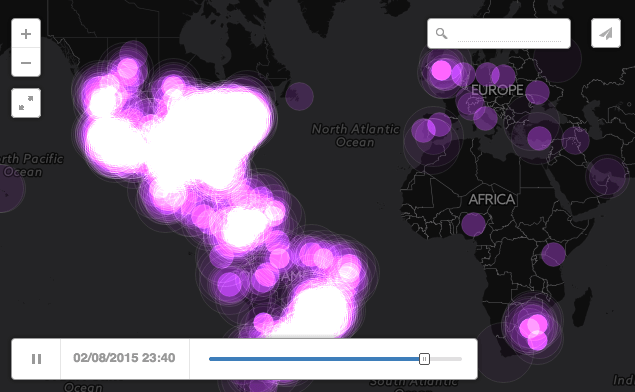
Data Visualization: How The World Reacted To Kanye, Sia Et Al At Grammys
February 10, 2015 by Dave Haynes

I have been blabbering on for anyone that will listen about the possibilities good data visualization has for digital signage.
I stress good because a lot of the visually interesting stuff I have seen falls down a little when you try to decode what the information is conveying. In other words, it can look cool, but what does it mean?
Here’s a case where it works on both counts: Here’s a visualization of the global social media activity – 20.9 million tweets and 45 million Facebook reactions – during the pre-show and telecast of the Grammy Awards the other night.
Now, the energy or logistics company, or bricks and mortar retailer, won’t have that volume of data to work with. But with some inventive thinking you could imagine how the data they do generate could result in interesting, ever-changing visuals about what’s happening in their businesses.
This is the source article.


I would suggest that full transparency for retailers about interactive data might backfire spectacularly when fueled by social media. Just like it did on the Grammys…
And the time to screen issues in most store and forward digital signage networks comes into play here. How impactful is this kind of data even an hour later?