Apple’s Gorgeous, Digital Signage-lite Stores
September 10, 2013 by Dave Haynes

Note: Revised based on reader comments …
Look around the retail landscape and you see no end of design directly influenced by Apple’s minimalist stores. They’re beautiful. The state of the retail design art. And they have little or no digital signage.
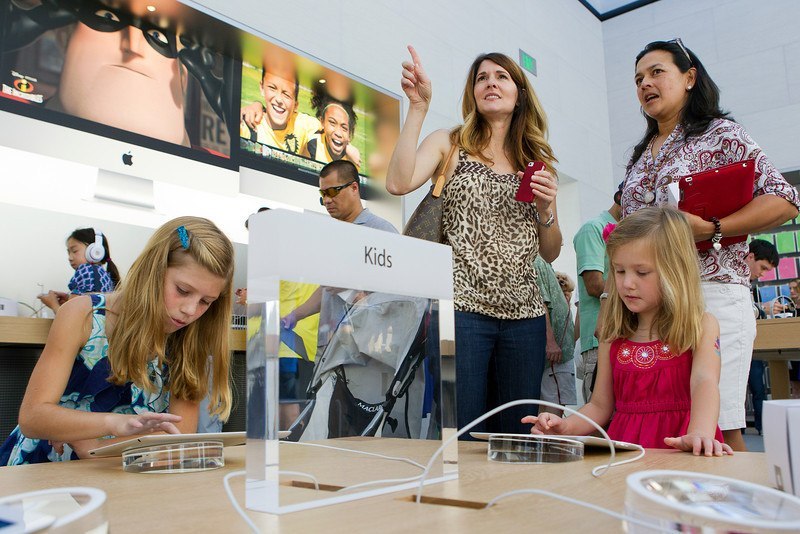
There are iPads on tables that could be called digital signage (I wouldn’t) and some temporary product launch stuff like giant iPhones in the storefront areas. Some stores have, as readers have pointed out, screens behind the genius bar.
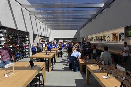
Apple just opened a new store near HQ, in Palo Alto’s Stanford Shopping Center. It’s stunning, predictably, and has a center wall design that splits the store in two and offers a huge feature wall visible from the street. That wall is lined with big, printed graphics.
The world’s top digital brand – likely constrained in no way by design budgets – gets its story across mostly with vinyl and printed stock.
A stunning new Apple Store opened this past Saturday morning. In collaboration with Apple Retail Development and a team of consultants, Bohlin Cywinski Jackson designed this two-room, pavilion-like store for a unique location within Palo Alto’s Stanford Shopping Center. A fresh and evolutionary direction, the design is a re-interpretation of many favorite architectural themes developed over the past 13 years, yet it retains many familiar elements associated with Apple Stores.
As expected, the tradition of Apple product being featured at the beginning of the customer experience continues, but here at Stanford, a broad, glass-enclosed room makes the retail environment feel part of the outdoor plaza and the outdoor plaza part of the retail environment. With 180 lineal feet of storefront glass and three entrances, rarely has a store been so visually recognizable and physically accessible. Its design invites you directly inside to experience the Apple product.
As a counterpoint to the front room’s translucency, the backspace, which is dedicated to service, training, and accessory retail space, is enclosed and calming. A sense of privacy and uniqueness supports the ambition for a place of gathering and learning– a community room. A glass roof fills the space with daylight and creates a perception of being outdoors.
There could be all kinds of arguments made about going digital with this graphic wall – from cost and compliance to the capability to set the mood and market differently by time of day. Yes, the Silicon Valley sun would threaten to dull the display output, but that’s a battle than can be won.

It likely has much, much more to do with the way Apple wants to deliver the experience and choreograph the environment and shopper journey. Unlike 99% of retailers, they don’t have to sell hard and drive awareness and impulse buying. People go there already knowing the brand, product and probably price.
Arguably, motion visuals would be distracting and are unnecessary. The whole compliance thing that’s the bane of most retailers and their merchandising messages probably, again, doesn’t apply here.
It’s not a normal retailer, so it doesn’t at all suggest digital display doesn’t really have a role in retail. It does in most settings. But an Apple store design is massively influential, and when there’s little or no digital signage to speak of, that’s directly or subliminally instructing the rest of the store design crowd that screens in the wall and elsewhere remain a nice to have, not a must-have.
The Microsoft stores appear to be heavily inspired by Apple store design, but the big print graphics have been replaced by narrow-seamed digital displays and active, even interactive content. As a digital sign guy I inherently like that, but I wonder how many retail designers are getting instructions from clients draw their design inspiration from Microsoft stores.
Note: Large photo from San Jose Mercury News


Leave a comment