
Does Web "banner blindness" correlate with in-store screen viewership?
September 11, 2007 by Dave Haynes
For those of us who found our way into this weird little space after a stint in what was “new media” 10 years ago, many will know the name Jakob Nielsen – a Web design and usability guru.
Much of his work has focused on the whole keep-it-simple-and-spartan look and feel for Web design. But he looks at other stuff, and recently wrote a piece (which I noticed in the MIT Ad Lab blog) about something called Banner Blindness. Simply put, this is the proposition that most Web surfers don’t even notice the banners that top and flank the pages of many commercial Web sites.
Nielsen’s group has done eyeball tracking studies on what people look at it surfing and came up with these conclusions:
The most prominent result from the new eyetracking studies is not actually new. We simply confirmed for the umpteenth time that banner blindness is real. Users almost never look at anything that looks like an advertisement, whether or not it’s actually an ad.
I mention this because I think what goes on with people who are Web surfing has at least some correlation with what happens in store and in other public places. Intuitively, I have to think people wandering around stores, malls and other public spaces are looking for stuff, and the screens are like banner ads. I have even heard network operators talk about how they think it takes a while — as in repeated impressions — for the ads to start burning in to people’s heads.
There’s even research to back up the assertion that repeated exposures will over time generate positive feelings about a product, even if people aren’t really paying attention to the banner ads.
Back to blindness:
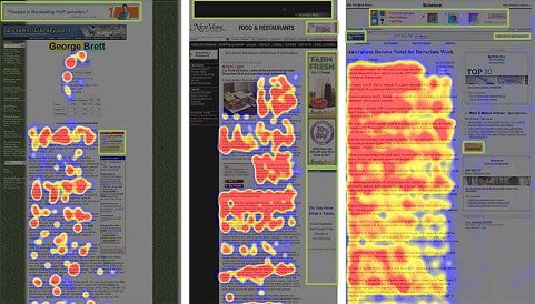
At all levels of user engagement, Nielsen writes, the finding is the same regarding banners (outlined with green boxes in the above illustration): almost no fixations within advertisements. If users are looking for a quick fact, they want to get done and aren’t diverted by banners; and if users are engrossed in a story, they’re not going to look away from the content.
The heatmaps also show how users don’t fixate within design elements that resemble ads, even if they aren’t ads.
Even when we did record a fixation within a banner, users typically didn’t engage with the advertisement. Often, users didn’t even see the advertiser’s logo or name, even when they glanced at one or two design elements elsewhere inside an ad.
There are four things that WILL make people look:
- plain text ads
- faces
- a woman’s cleavage, or other slightly naughty parts
- ads that look more like content or site elements (in other words, ads that don’t look like ads)
Neilsen explains:
In addition to the three main design elements that occasionally attract fixations in online ads, we discovered a fourth approach that breaks one of publishing’s main ethical principles by making the ad look like content:
– The more an ad looks like a native site component, the more users will look at it.
– Not only should the ad look like the site’s other design elements, it should appear to be part of the specific page section in which it’s displayed.
Using that notion, would that mean that spots running in a retail setting should try to share the look, feel and attitude of the store design and POP material. I’m not sure that’s going to work in the same way.
However, I can easily see more people noticing a healthy chest or a six-packed set of abs than a spinning product shot on a screen.
Leave a comment